Notes App
Notes App
Notes App
UX/UI CASE STUDY
UX/UI CASE STUDY
UX/UI CASE STUDY
A mobile-only app used for capturing ideas quickly and syncing them automatically with a Notion database.
A mobile-only app used for capturing ideas quickly and syncing them automatically with a Notion database.
A mobile-only app used for capturing ideas quickly and syncing them automatically with a Notion database.
This is a short and sweet version of the case study. You can read the whole story here →
This is a short and sweet version of the case study. You can read the whole story here →
This is a short and sweet version of the case study. You can read the whole story here →
Project Details
Project Details
Project Details
MY ROLE
MY ROLE
MY ROLE
Product designer
Solo side project
Product designer
Solo side project
Product designer
Solo side project
TOOLS
TOOLS
TOOLS
Figma
Notion
Material Design
Figma
Notion
Material Design
Figma
Notion
Material Design
PROJECT DURATION
PROJECT DURATION
PROJECT DURATION
3 weeks
3 weeks
3 weeks
THE PROBLEM
THE PROBLEM
THE PROBLEM
Taking notes in Notion is sluggish when online and impossible when offline
Taking notes in Notion is sluggish when online and impossible when offline
Taking notes in Notion is sluggish when online and impossible when offline
Notion is an all-in-one platform for organizing your work and life. It isn't just a note-taking app, but a project management tool, a writing app, and more simultaneously.
The app can be used in many ways — note-taking is just one of the many functionalities. As a result, using the Notion mobile app to capture ideas on the go is slow and complicated.
Taking a simple note in the mobile Notion app takes 20-30 seconds and more than 3 clicks with the number of options available on and off-screen (a sure way to lead even long-time Notion users to decision fatigue).
GOALS
GOALS
GOALS
Quick and easy note-taking with offline capability
Quick and easy note-taking with offline capability
Quick and easy note-taking with offline capability
There are two main goals:
Design a simple app for Notion users can use to capture ideas quickly and effortlessly on their mobile phones.
Create a note-taking app that stores information locally and also syncs to a Notion database.
There are two main goals:
Design a simple app for Notion users can use to capture ideas quickly and effortlessly on their mobile phones.
Create a note-taking app that stores information locally and also syncs to a Notion database.
There are two main goals:
Design a simple app for Notion users can use to capture ideas quickly and effortlessly on their mobile phones.
Create a note-taking app that stores information locally and also syncs to a Notion database.
THE SOLUTION
THE SOLUTION
THE SOLUTION
Light Notes App that syncs with a Notion database
Light Notes App that syncs with a Notion database
Light Notes App that syncs with a Notion database

1. Take notes quickly
Take notes with less than 3 clicks and store them locally on your phone.
2. Sync with Notion
Sync with a Notion database and access and edit your notes in your desktop app.

Research & Analysis
Research & Analysis
Research & Analysis
To understand why the mobile Notion app isn’t great for taking notes on mobile devices, we need to take a closer look at the step-by-step user flow:
To understand why the mobile Notion app isn’t great for taking notes on mobile devices, we need to take a closer look at the step-by-step user flow:
To understand why the mobile Notion app isn’t great for taking notes on mobile devices, we need to take a closer look at the step-by-step user flow:

The simplest path is this: Open Notion → Open note database → Create note.
This sounds simple enough, but combined with the Notion app slow loading times, even this simple 3-step process takes approximately 20–30 seconds to complete. When the need to navigate within the database is added to this process, it might take a whole minute.
This is too long when you have an idea you need to jot down during a meeting and also when compared to other apps. Creating a quick note in Google Keep, for example, takes three steps and less than 10 seconds. Here is a quick competitive analysis of other note-taking apps:

The comparative analysis above provides us with the following conclusions:
The note-taking process must be of 3-steps (Open → Create New Note → Write)
The notes must be available offline
The notes must be synced with a database in the Notion app so they can be opened on all platforms and devices and edited there
The app must be free
The app should have some organizing options, however, they need to be kept as few as possible. The Notion desktop app already offers great filter, tagging, sorting, etc. options, so the app doesn’t need to do the same.
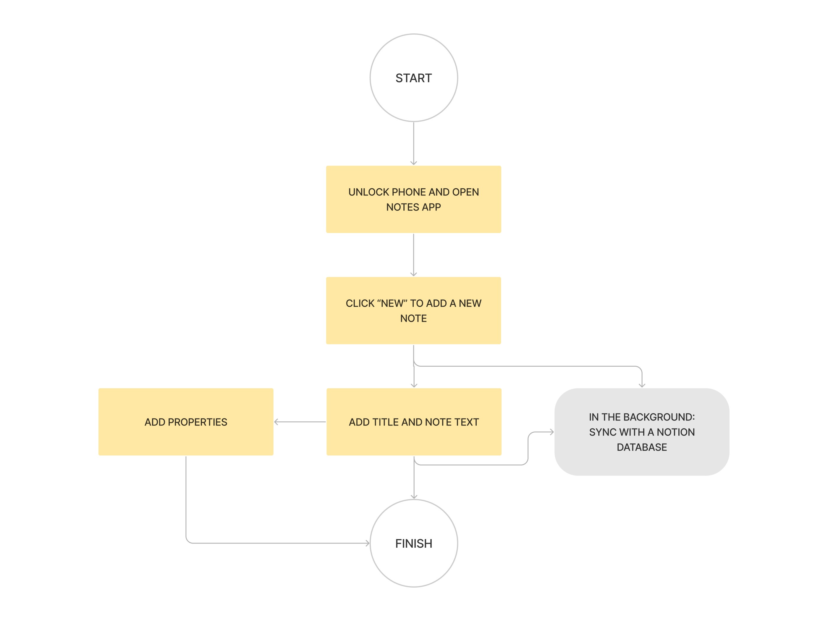
Here are the simplified user flows for the one-time onboarding process and for taking a simple note:
The comparative analysis above provides us with the following conclusions:
The note-taking process must be of 3-steps (Open → Create New Note → Write)
The notes must be available offline
The notes must be synced with a database in the Notion app so they can be opened on all platforms and devices and edited there
The app must be free
The app should have some organizing options, however, they need to be kept as few as possible. The Notion desktop app already offers great filter, tagging, sorting, etc. options, so the app doesn’t need to do the same.
Here are the simplified user flows for the one-time onboarding process and for taking a simple note:

Personas
Notion users are mostly students and young professionals aged between 17 and 35 years old. I have chosen two personas, based on several active content creators and YouTubers who offer insights into how they use Notion in their work and personal life.
I compiled two personas from all of them — one for a teenage student and another one for a successful content creator.


Scenarios
Since Notion’s audience mainly consists of teenagers, this case study is focused on Molly’s persona. Nevertheless, I included scenarios for both Mark and Molly.
The first scenario is Molly taking a super quick note about an article idea during an inspiring guest lecture. The second scenario is Mark taking a note about a video idea he has shortly after boarding a plane from Singapore to Vienna.
Ideation
Ideation
Ideation
After analyzing the research I used my findings to sketch and create a low fidelity prototype. Here are some of the wireframes for the onboarding, note-taking and settings:
After analyzing the research I used my findings to sketch and create a low fidelity prototype. Here are some of the wireframes for the onboarding, note-taking and settings:
After analyzing the research I used my findings to sketch and create a low fidelity prototype. Here are some of the wireframes for the onboarding, note-taking and settings:

High Fidelity Prototype
High Fidelity Prototype
High Fidelity Prototype
The high-fidelity design is based on the Material Design 3 Kit. The avatars I used are the Open Peeps by Pablo Stanley and the icons are the soft and playful Start Universal Icons package by Salah Elimam.
The high-fidelity design is based on the Material Design 3 Kit. The avatars I used are the Open Peeps by Pablo Stanley and the icons are the soft and playful Start Universal Icons package by Salah Elimam.
The high-fidelity design is based on the Material Design 3 Kit. The avatars I used are the Open Peeps by Pablo Stanley and the icons are the soft and playful Start Universal Icons package by Salah Elimam.
Style Guide
Style Guide
Style Guide
The main goal of this design system is to look and feel like Notion so the user doesn’t need to get familiar with a new UI.
The main goal of this design system is to look and feel like Notion so the user doesn’t need to get familiar with a new UI.
The main goal of this design system is to look and feel like Notion so the user doesn’t need to get familiar with a new UI.


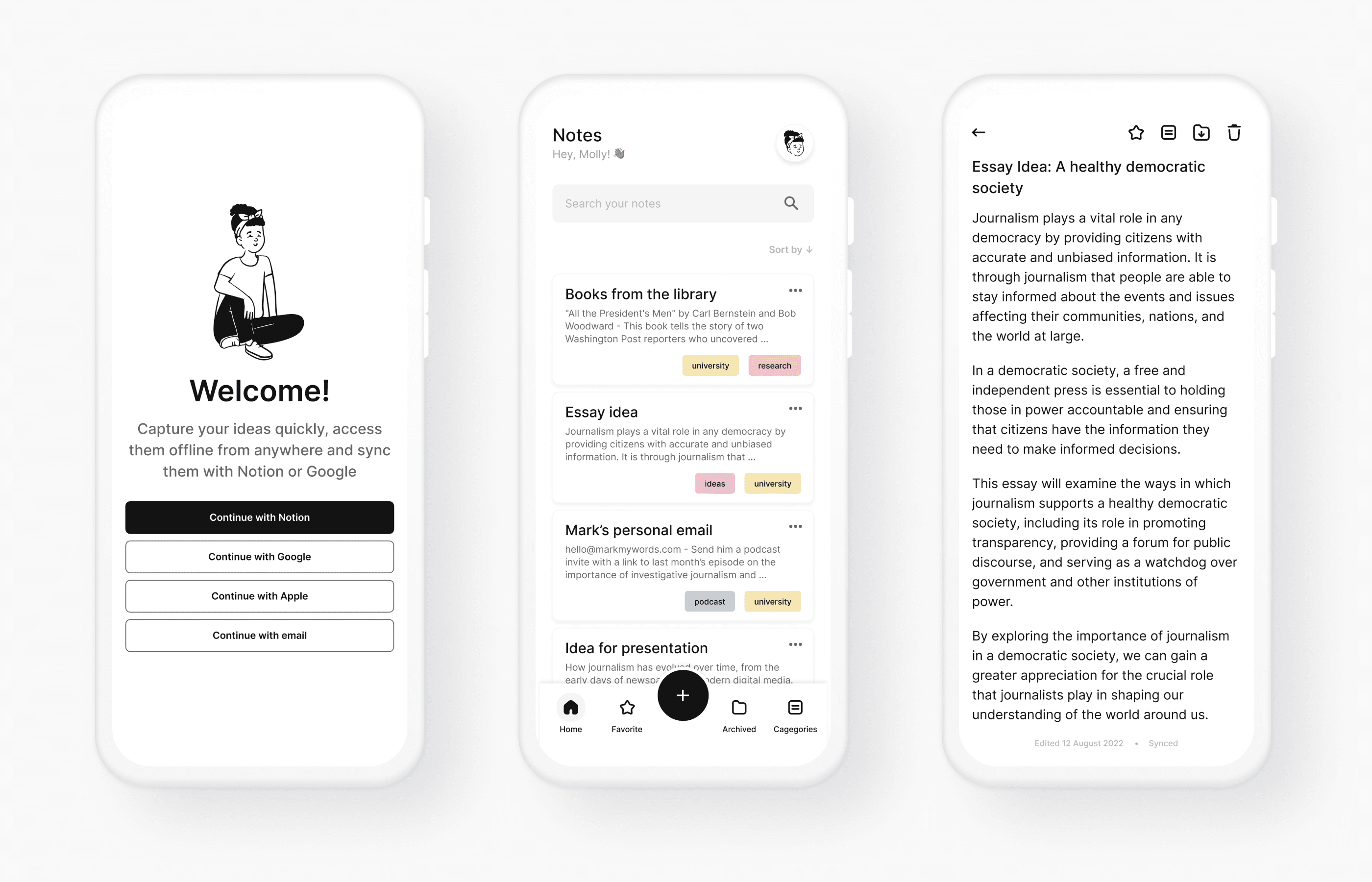
The Notes App
The Notes App
The Notes App
The final solution is a simple-looking but extremely useful app Notion users should be able to start using seamlessly and without any tutorials.
The final solution is a simple-looking but extremely useful app Notion users should be able to start using seamlessly and without any tutorials.
The final solution is a simple-looking but extremely useful app Notion users should be able to start using seamlessly and without any tutorials.


Takeaways
Takeaways
Takeaways
There are a lot of note-taking apps out there but they all have similar issues. Either they don’t sync with a desktop version, so there is no easy way to sort and edit your work, or they do have a desktop version and carry too many features from it to the mobile app.
Most of us use our phones to capture ideas, not to edit large bodies of text and this is what the mobile version of a note-taking app should focus on.
Even though it is unlikely an app such as this will solve Notion’s lack-of-an-offline-mode issue, it would be a useful addition to the digital toolkit of any young professional seeking to improve their productivity.
