Bakery Website
Bakery Website
Bakery Website
UX/UI CASE STUDY
UX/UI CASE STUDY
UX/UI CASE STUDY
Redesign for a popular artisanal bakery chain in London called buns from home.
Redesign for a popular artisanal bakery chain in London called buns from home.
Redesign for a popular artisanal bakery chain in London called buns from home.

This is a short and sweet version of the case study. You can read the whole story here →
This is a short and sweet version of the case study. You can read the whole story here →
This is a short and sweet version of the case study. You can read the whole story here →
Project Details
Project Details
Project Details
MY ROLE
MY ROLE
MY ROLE
Web designer
Solo side project
Web designer
Solo side project
Web designer
Solo side project
TOOLS
TOOLS
TOOLS
Figma
Adobe Illustrator
Squarespace
Figma
Adobe Illustrator
Squarespace
Figma
Adobe Illustrator
Squarespace
PROJECT DURATION
PROJECT DURATION
PROJECT DURATION
2 weeks
2 weeks
2 weeks
THE PROBLEM
THE PROBLEM
THE PROBLEM
The quality of the product and the popularity of the brand need a better online home
The quality of the product and the popularity of the brand need a better online home
The quality of the product and the popularity of the brand need a better online home
So far the bakery has six locations in popular neighborhoods and there are plans to open even more. The growing popularity of the bakery chain demands a website that matches its fun brand and highlights the excellence of its baked goods.
So far the bakery has six locations in popular neighborhoods and there are plans to open even more. The growing popularity of the bakery chain demands a website that matches its fun brand and highlights the excellence of its baked goods.
So far the bakery has six locations in popular neighborhoods and there are plans to open even more. The growing popularity of the bakery chain demands a website that matches its fun brand and highlights the excellence of its baked goods.
GOALS
GOALS
GOALS
Lead people to the nearest bakery, stat
Lead people to the nearest bakery, stat
Lead people to the nearest bakery, stat
The goal of this project was to create a website where the current and future buns from home customers can quickly find the information they need to visit one of the bakery locations or order online on an off-site platform (Deliveroo).
The goal of this project was to create a website where the current and future buns from home customers can quickly find the information they need to visit one of the bakery locations or order online on an off-site platform (Deliveroo).
The goal of this project was to create a website where the current and future buns from home customers can quickly find the information they need to visit one of the bakery locations or order online on an off-site platform (Deliveroo).
THE SOLUTION
THE SOLUTION
THE SOLUTION
A responsive website people can use to find essential information about the nearest to them bakery
A responsive website people can use to find essential information about the nearest to them bakery
A responsive website people can use to find essential information about the nearest to them bakery

1. Responsive design
The website is easy to navigate from a mobile phone on the go and a desktop when planning some London adventures.
2. On Brand
Made full use of the current brand elements, colors, and the constant stream of stunning Instagram photos.
Research & Analysis
Research & Analysis
Research & Analysis
Currently, the website receives about 14k monthly visits. All orders and deliveries go through deliveroo.co.uk. People cannot order through the website itself and the plan is to keep it that way. For the time being, the priority is opening more physical locations around London.
The lack of e-commerce functionality and a blog makes the website a static landing page. Here is the current website with all its issues:

The current website does not:
deliver any meaningful information above the fold
highlight essential for the customer information on the home page
provide any indication of the popularity of the bakery on Instagram
nurture a sense of community
give any information about dietary accomodations (vegan, halal, etc.)
state any benefits of signing up for a newsletter
provide a meaningful contact form
showcase reviews and testimonials from happy customers and food critics
tell the story of the founders, even though it is one of the main things that sets them apart from other brands
show photos of the products
All these need to be addressed and so the website will end up with two main goals:
To inform
The primary goal of the website is to give easy access to information about delivery options, locations, opening times, etc.
To inspire
The bakery’s offerings fall more into the “hedonistic indulgence for the senses” category and less under the “healthy option” one.
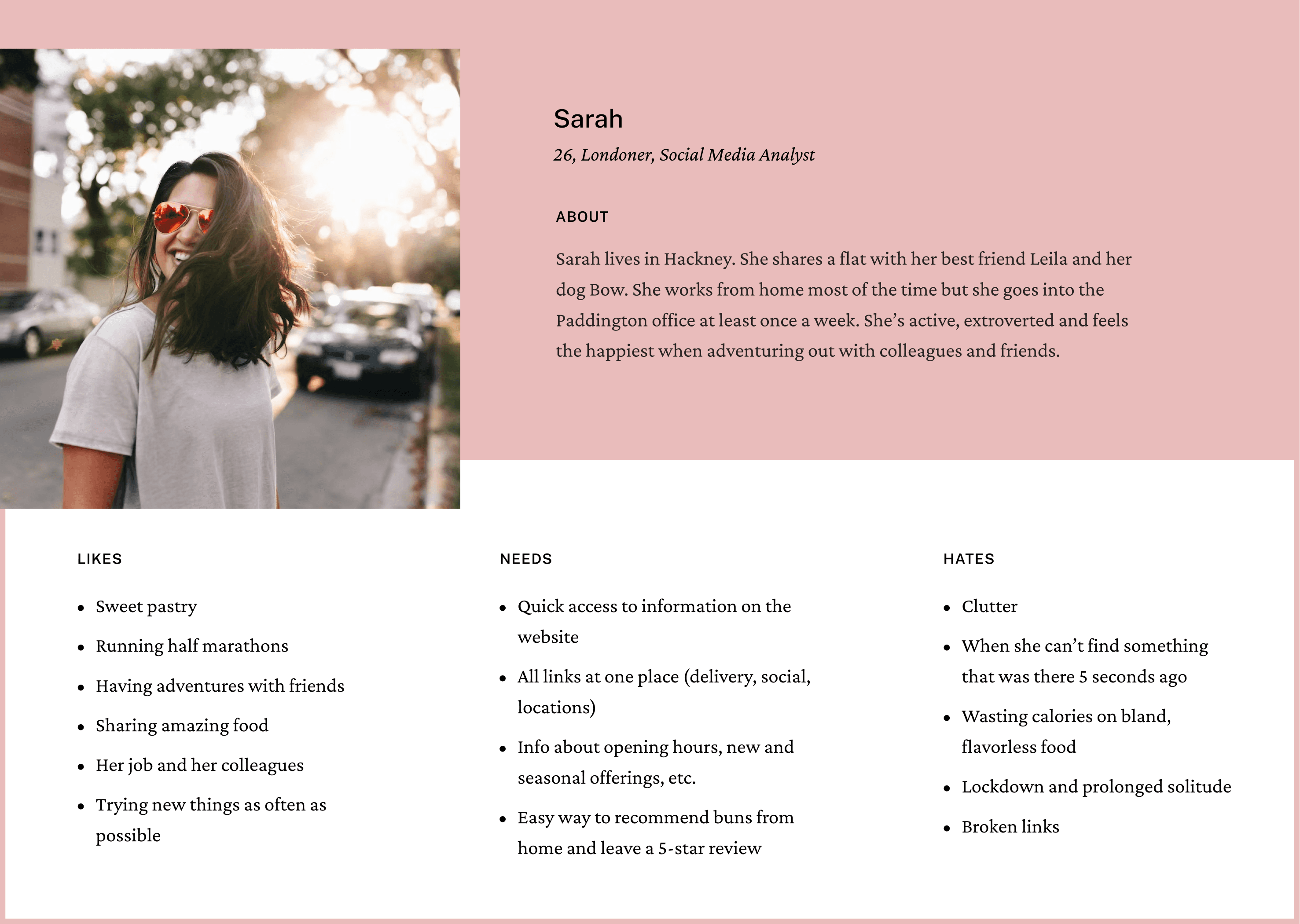
Persona
Based on my findings during the initial research phase, I came up with one persona. The typical buns from home customer uses the website to find information about the bakery, such as delivery options, locations, opening hours and more.
Persona
Based on my findings during the initial research phase, I came up with one persona. The typical buns from home customer uses the website to find information about the bakery, such as delivery options, locations, opening hours and more.
Persona
Based on my findings during the initial research phase, I came up with one persona. The typical buns from home customer uses the website to find information about the bakery, such as delivery options, locations, opening hours and more.
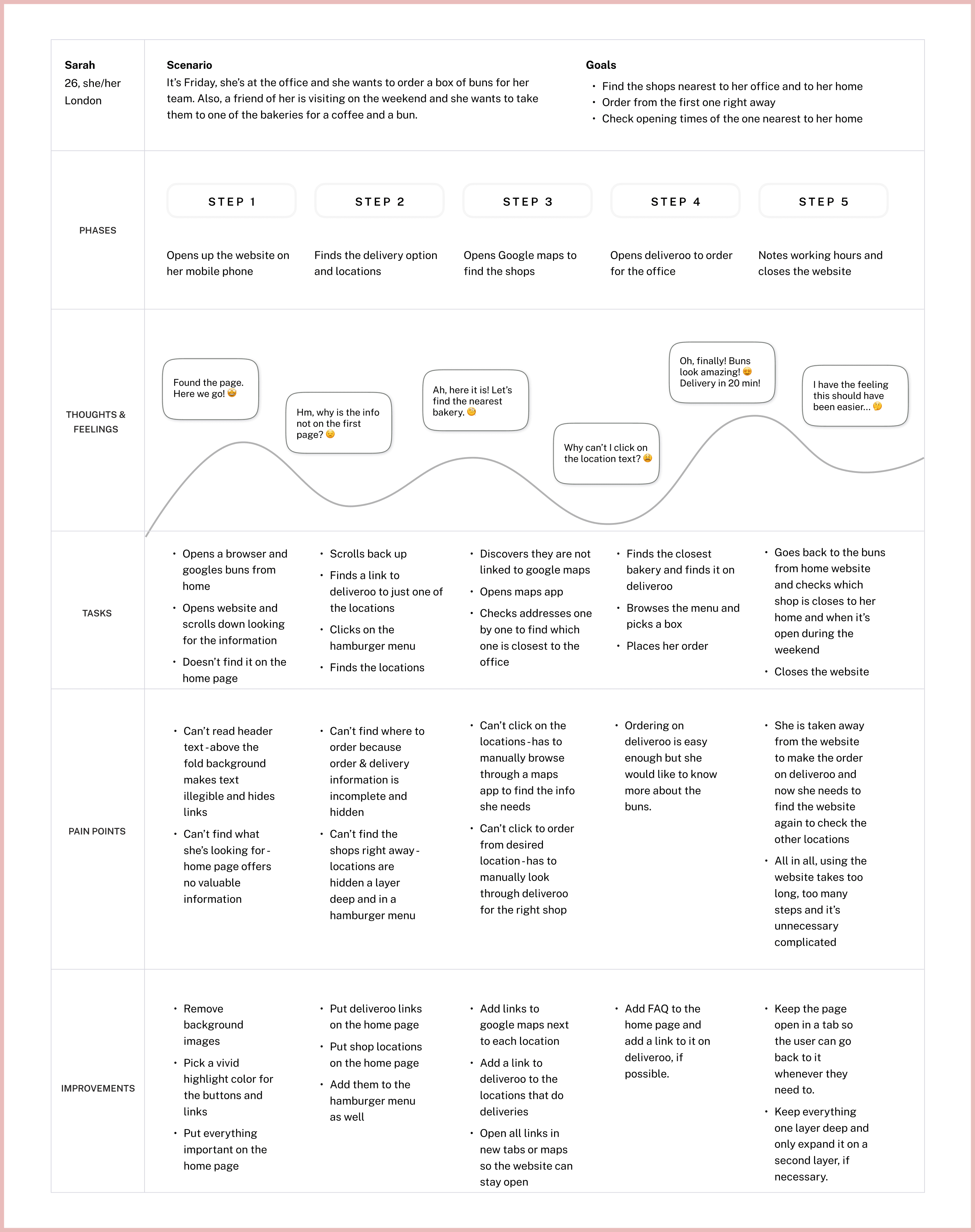
Customer Journey Map
Here is what a customer journey might look like for Sarah:
It’s Friday, she’s at the office and she wants to order a box of buns for her team. Also, a friend of hers is visiting on the weekend and she wants to take them to one of the bakeries for a coffee and a scrumptious bun.
Customer Journey Map
Here is what a customer journey might look like for Sarah:
It’s Friday, she’s at the office and she wants to order a box of buns for her team. Also, a friend of hers is visiting on the weekend and she wants to take them to one of the bakeries for a coffee and a scrumptious bun.
Customer Journey Map
Here is what a customer journey might look like for Sarah:
It’s Friday, she’s at the office and she wants to order a box of buns for her team. Also, a friend of hers is visiting on the weekend and she wants to take them to one of the bakeries for a coffee and a scrumptious bun.
Ideation
Ideation
Ideation
The buns from home website is hosted on Squarespace. Squarespace uses sections and blocks on each page so the wireframe is created according to these design parameters.
The buns from home website is hosted on Squarespace. Squarespace uses sections and blocks on each page so the wireframe is created according to these design parameters.
The buns from home website is hosted on Squarespace. Squarespace uses sections and blocks on each page so the wireframe is created according to these design parameters.
High Fidelity Prototype
High Fidelity Prototype
High Fidelity Prototype
The buns from home brand already has some design elements, which I gathered in one place. I also made some minor adjustments and added new elements only where needed.
The buns from home brand already has some design elements, which I gathered in one place. I also made some minor adjustments and added new elements only where needed.
The buns from home brand already has some design elements, which I gathered in one place. I also made some minor adjustments and added new elements only where needed.
Branding
Branding
Branding
Most buns from home brand elements can be found on their packaging (the house logo), on their physical storefronts (the small caps logo), and on their social media accounts (the house sub-mark). The current website isn’t using any of those elements. The new website needs to incorporate all of them.
Most buns from home brand elements can be found on their packaging (the house logo), on their physical storefronts (the small caps logo), and on their social media accounts (the house sub-mark). The current website isn’t using any of those elements. The new website needs to incorporate all of them.
Most buns from home brand elements can be found on their packaging (the house logo), on their physical storefronts (the small caps logo), and on their social media accounts (the house sub-mark). The current website isn’t using any of those elements. The new website needs to incorporate all of them.


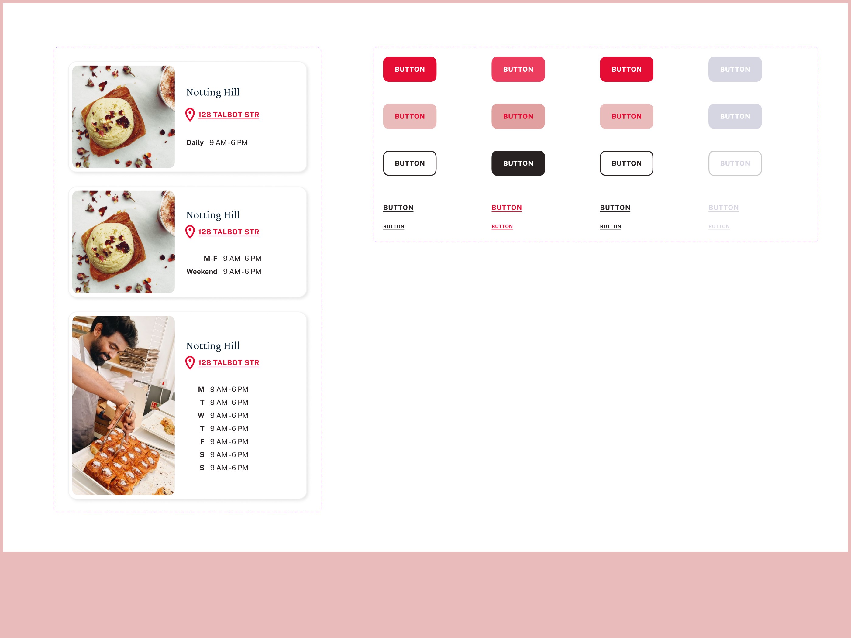
Elements
Elements
Elements
All photos used on this website come from the buns from home Instagram account. This was one of the requirements and restrictions of this project. To make their use on a Squarespace-hosted website easy and consistent, they are used “as is” without the rounded edges of the buttons and graphic elements.
The buttons have rounded “bun” edges. Buttons use the two highlight colors and all links use the bright pink accent color to indicate clickable text.
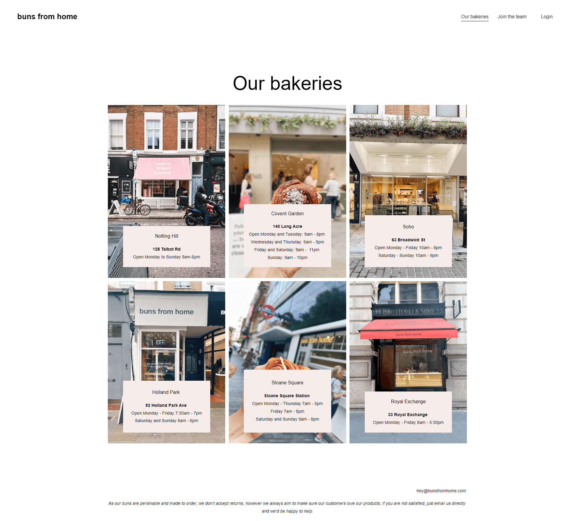
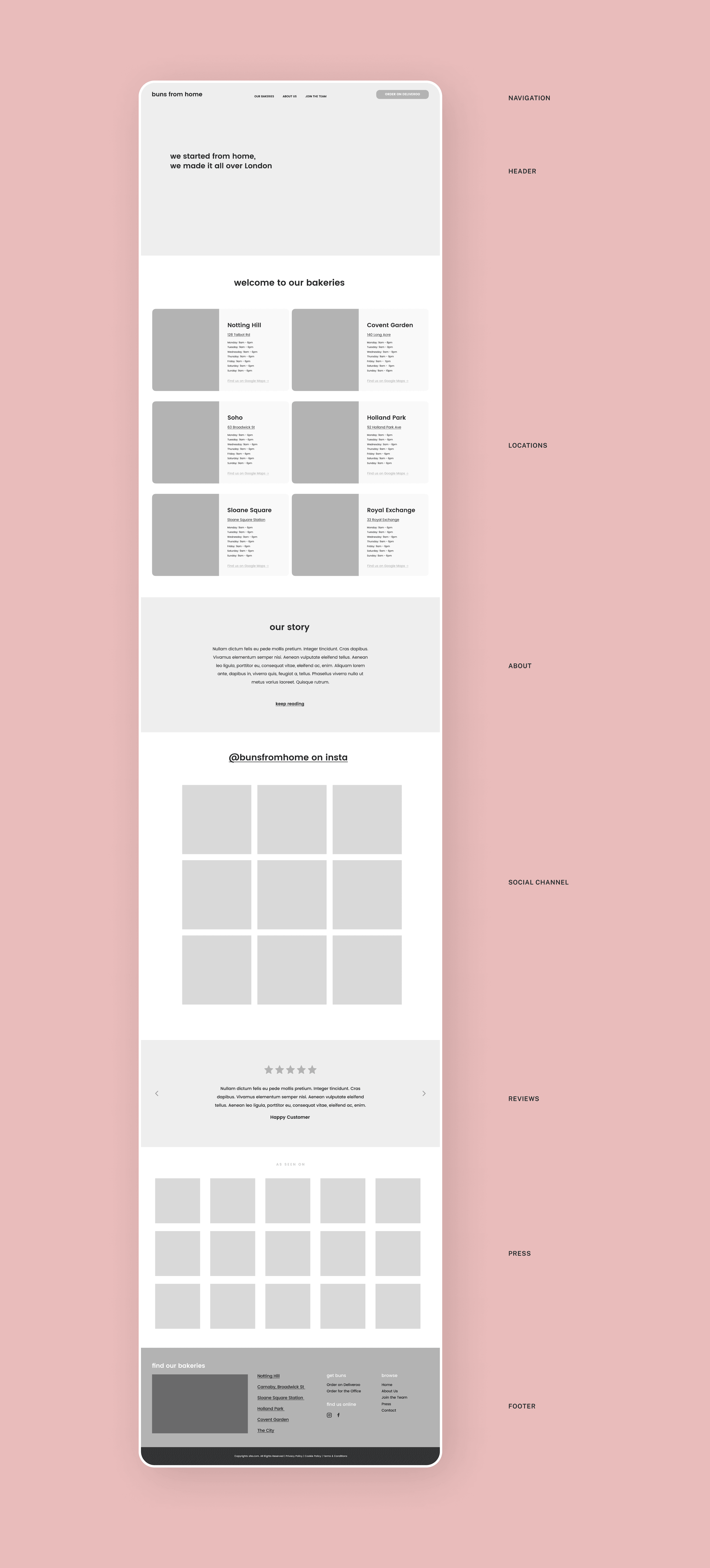
The Buns From Home Website
The Buns From Home Website
The Buns From Home Website
The final solution is an elegant and bright website, full of useful information, CTAs, and street credit.
The final solution is an elegant and bright website, full of useful information, CTAs, and street credit.
The final solution is an elegant and bright website, full of useful information, CTAs, and street credit.

Takeaways
Takeaways
Takeaways
Key Takeaways
A website that doesn’t sell but advertises and informs should have most, if not all of the information on the first level.
People mostly use their phones to check for locations and opening hours so the mobile version of any information website should load quickly and be easy to navigate without hiding important information on second layers.
As much as possible, descriptions on information websites should be clickable and lead to maps, shops, social proof, etc. The goal of an info website isn’t to retain visitors for longer but to invite them to buy or visit.
Conclusion
buns from home is a bakery with a beloved signature product, undeniable success throughout central London, and great popularity online. I hope! this web design, should they choose to use it, will help the team spread the word about their culinary magic fast and wide and give their current and future customers another way to become their loyal fans.